| Author | Message | ||
Pete B (Downunderdisco) New Member Username: Downunderdisco Post Number: 81 Registered: 11-2002 |
I feel like an extra out of "the Emperors New Clothes". Is everyone else just too scared to say it?! the old board was one of the best Ive seen. Very clear and concise. This one is overdone, too busy, too flash, shite. I hate it. Just thought I'd say. | ||
Leslie N. Bright (Leslie) Senior member Username: Leslie Post Number: 1769 Registered: 02-2002 |
Hmmm........... I'm on a couple of Roo boards, and they're more like this new board, as far as the new changes go (defintely not content, though!) So, they're not a shock to the system, to me... No, I had no problems with the old board as it was, but.... the same folks are here with the same posts, the breakdown of the boards is the same, it just has a few extra bells and whistles that don't bother me.... IMHO, FWIW.... -L | ||
Andrew Clarke (Aclarke) advanced member Username: Aclarke Post Number: 240 Registered: 10-2002 |
I like the new setup more, personally. | ||
Blue (Bluegill) Senior member Username: Bluegill Post Number: 1877 Registered: 02-2002 |
Hey Petey, if the screen was hot pink and the characters were made to look like they were written with a paintbrush dipped in shit, I think we'd all still be clicking away, so SHUT THE FUCK UP  - there's a smiley face to make you feel better - there's a smiley face to make you feel better | ||
Leslie N. Bright (Leslie) Senior member Username: Leslie Post Number: 1771 Registered: 02-2002 |
lol.... 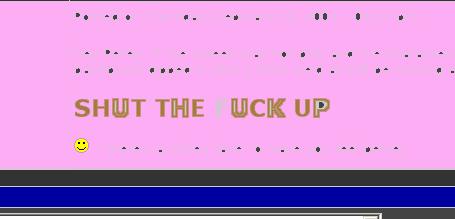 -L | ||
Carter Simcoe (Carter) Senior member Username: Carter Post Number: 1837 Registered: 04-2002 |
Also try this:  I like the board and am glad the dweb team is spending the time to keep it up. | ||
Carter Simcoe (Carter) Senior member Username: Carter Post Number: 1838 Registered: 04-2002 |
 | ||
Prescottj (Prescottj) Advanced member Username: Prescottj Post Number: 156 Registered: 12-2002 |
hey I got that same picture framed behind my desk at work | ||
Phillip Perkinson (Rover4x4) Member Username: Rover4x4 Post Number: 18 Registered: 02-2003 |
I wonder why we gotta post such small pictures now? | ||
David Morin (Sporin) New Member Username: Sporin Post Number: 2 Registered: 02-2003 |
I like this USB format a lot myself. it's what most of the bigger bb's use, and it's what I'm mostly used to. It is also (supposedly) easy to administer, update, configure, etc. I'd like to see that bright yellow and blue toned down a bit though. maybe replace the yellow with the cream color from the old board, and the blue with a sage or khaki green of some sort, just to get all the tonal ranges aligned. Sorry.. graphic designer here. | ||
Blue (Bluegill) Senior member Username: Bluegill Post Number: 1880 Registered: 02-2002 |
you gotta problem with blue? and you just can't beat H2 yella... | ||
Prescottj (Prescottj) Advanced member Username: Prescottj Post Number: 157 Registered: 12-2002 |
Sage or Khaki Green? You have been watching way to much home designer with the gay guy on the discovery channel or you hang around with too many people that sport the clothes that the dealer sells in the showroom | ||
David Morin (Sporin) New Member Username: Sporin Post Number: 3 Registered: 02-2003 |
I actually don't have a big problem with it, but since that was the topic, I weighed in with my opinion. The bright yellow and bright blue are just very arresting compared to the soft grays and creams through the rest of the site. | ||
David Morin (Sporin) New Member Username: Sporin Post Number: 4 Registered: 02-2003 |
I'm a graphic designer... it's my J-O-B to talk color. :-) | ||
Blue (Bluegill) Senior member Username: Bluegill Post Number: 1882 Registered: 02-2002 |
don't you go creaming through the rest of the site.... | ||
Prescottj (Prescottj) Advanced member Username: Prescottj Post Number: 159 Registered: 12-2002 |
Well I have considered surfing discoweb my new J-O-B and I like the new setup how it is. Seems like the majority likes it and maybe you should start designing around what the people want. Post some links of your work and I'll tell you what I think. | ||
David Morin (Sporin) New Member Username: Sporin Post Number: 5 Registered: 02-2003 |
Ouch! hey sorry.,. didn't mean to step on anyone's toes. - The thread was about the new forum. - I posted that I really LIKED the new forum and that it is the same format as many other sites I surf frequently. - If I had to change anything, it would be a few of the colors. - No reason to get angry, I meant no disrespect. - Why so defensive? I'll happily post a few sites I've designed, but I really don't want to turn this into some sort of pissing match as that is never what I intended... not by a long shot. Hope we're cool. | ||
Prescottj (Prescottj) Advanced member Username: Prescottj Post Number: 161 Registered: 12-2002 |
maybe it's just that DAMN Red smiley face looks so DAMN intimadating to me. I wasn't really trying to be harsh. Would really like to see some of your work and remeber my opinion is always free. | ||
Axel Haakonsen (Axel) Moderator Username: Axel Post Number: 17 Registered: 02-2003 |
Actually, we don't mind suggestions. David, why don't you post the color codes you suggest we should be using, and if it ends up looking better, I have no problem with implementing them. Axel Check out the items in the Discoweb store: Videos: Moab 2001, Hole in the Rock, Back East. Rubicon and Dusy Ershim videos coming soon. Other: Tshirts and stickers. The DiscoWeb Store | ||
Peter Matusov (Pmatusov) advanced member Username: Pmatusov Post Number: 463 Registered: 09-2002 |
well.... aside from the fact that i liked black on white better than white on black... Axel, please, change the BLUE bars to dark green, something like 006600. Blue belongs in Arizona peter | ||
Peter Matusov (Pmatusov) advanced member Username: Pmatusov Post Number: 464 Registered: 09-2002 |
dark red would work, too even dark brown | ||
KJ (Karen) Senior member Username: Karen Post Number: 27 Registered: 02-2002 |
Blue, that post to Pete wasn't very Hobbit-like, now was it? Hey Pete, are the days getting shorter in Oz? Ours are getting looooonger..... Karen | ||
David Morin (Sporin) New Member Username: Sporin Post Number: 6 Registered: 02-2003 |
Sorry, "tone" just never seems to come through correctly on the web. I apologies if I offended anyone. If it were me (and it's not) I would change the bright blue (#000099) to dark green #336633. And the bright yellow (#FFFF00) to tan #CCCC99. You would wind up with something very Rover-looking like this . . . http://www.nomadcom.com/dave/test.gif And, again, I am NOT trying to be a know-it-all smart ass, I swear. Here are a couple sites I've designed over the years. The Callaway Golf Boston site is the newest, just launched last month, and I think it's some of my best web work. Some of the others are older, some are smaller and simpler. I'm primarily a print designer, but we do web work for clients as well. http://www.callawaygolfboston.com/ http://www.dartmouth.edu/~dickey/ http://www.topridge.com http://www.sandskiing.com/ http://www.nomadcom.com/home.html http://www.alpinasports.com/ | ||
Carter Simcoe (Carter) Senior member Username: Carter Post Number: 1850 Registered: 04-2002 |
hey, that is very Rover looking. If Ax is indeed open to suggestions I would give that one my vote. | ||
TPH (Snowman) advanced member Username: Snowman Post Number: 231 Registered: 12-2002 |
Would not having your "own" DWeb colors be a bit more unique than the official LR colors? I would rather not have all Rover related sites and LR business ventures be so generic in scheme. No doubt DWeb is the best, you all deserve a big box of chocolate today. Hey Dave- -20 this A.M. in N. VT, wicked eh? S- | ||
Leslie N. Bright (Leslie) Senior member Username: Leslie Post Number: 1774 Registered: 02-2002 |
http://www.nomadcom.com/dave/test.gif I have to admit, I like that green too..... -L | ||
David Morin (Sporin) New Member Username: Sporin Post Number: 8 Registered: 02-2003 |
TPH, Minus 14 at my house in Windsor when I left at 7am' Thought the 4Runner wasn't going to start there for a minute. I'm a guy who really likes winter, and snow, but I am completely DONE with it this season. So much snow, so many bitter cold days.. I'm anxiously awaiting spring. | ||
Sus (Susannah) New Member Username: Susannah Post Number: 390 Registered: 06-2002 |
I vote for the green. I have to admit, that coming back onto D-web after a week's absence was SHOCKING!!!! I do find the layout and posts a little flashy and busy, but you get used to it. Sort-of like that new CNN Headline news they came out with last year....a little too much information at once, but you eventually find what you're looking for. My only concern is that I can't seem to fit it all in the screen. I think Rover colors would be good. And as always, I'm just thankin' the admin guys for keeping it up! | ||
Phillip Perkinson (Rover4x4) Member Username: Rover4x4 Post Number: 24 Registered: 02-2003 |
its nice how you can type in a www. link and not have to enter some funky code | ||
Blue (Bluegill) Senior member Username: Bluegill Post Number: 1887 Registered: 02-2002 |
that green is sharp | ||
Greg French (Gregfrench) advanced member Username: Gregfrench Post Number: 195 Registered: 11-2002 |
Ok...Now I am a NA member. What does that mean? I went from "junior" to "member" to "advanced" then skipped right over "senior" (which is ok for me...not ready to be called that yet) and am now "na". Forgive me if this question has been addressed in another thread. | ||
Ho Chung (Thediscoho) Moderator Username: Thediscoho Post Number: 28 Registered: 02-2002 |
you are forgiven. just DO IT!! | ||
Sus (Susannah) Senior Member Username: Susannah Post Number: 392 Registered: 06-2002 |
Well, I'm a new member somehow! | ||
Gabriel Guay (Gearhead) New Member Username: Gearhead Post Number: 27 Registered: 04-2002 |
Holy shit man! I go away for a week and all hell breaks loose. Well I also like the green and tan colors. I don't have an issue with the new bbs other than I need to veiw full screen to fit it all on the screen but, I'm sure that's a IE setting problem on my end. I don't normally post very often but, thanks for keeping up the site and BBS. Gabe | ||
Gabriel Guay (Gearhead) New Member Username: Gearhead Post Number: 28 Registered: 04-2002 |
Looks like now I'm a new member. Does that mean I will look younger in the morning and find the odometer turning back on the rover? Wishfull thinking. Gabe | ||
Axel Haakonsen (Axel) Moderator Username: Axel Post Number: 23 Registered: 02-2003 |
Ok, as you can see,the colors have now changed, and I think this color scheme is less glaring than the blue and bright yellow. Thanks to David for suggesting the new colors, it saved me a lot of time on trying to figure out a good set of color codes. Now, about the voting on each post, what is the general consensus on that? It seems to be a pretty useless feature to me. I am leaning towards shutting it off to so that the messages will be displayed a little closer together. We don't really need to be able to put stars on the posts, do we? It was fun in the beginning, but it seems to get old really fast. Axel  | ||
KJ (Karen) Senior member Username: Karen Post Number: 44 Registered: 02-2002 |
Axel, The site looks better now with the new colors, and I didn't mind this first ones. Just an unexpected improvement. Kudos to you for being so open to suggestions. As for the voting, I agree, it was fun for five minutes, but the novelty wears off quickly. JMO. Karen | ||
TPH (Snowman) advanced member Username: Snowman Post Number: 237 Registered: 12-2002 |
Axel- I agree to remove the voting and to move messages closer together. Function over fashion? S- | ||
John Moore (Jmoore) advanced member Username: Jmoore Post Number: 389 Registered: 10-2002 |
Great Colors, lose the voting! It seems also easier with the new colors to tell which theads you've read, versus new ones. Thanks! -John | ||
KJ (Karen) Senior member Username: Karen Post Number: 45 Registered: 02-2002 |
That's the only place I'd disagree. I think the "read" posts color and new posts color are still too similar, but I was one of those who said that when the board first changed. Not to nit-pick, but since it was mentioned.....FWIW. Karen | ||
Glenn Guinto (Glenn) Senior Member Username: Glenn Post Number: 476 Registered: 02-2002 |
Ax, Just a suggestion, how do you feel about having the location (at least the state) under the user names? I participate in another board and they have locations under the usernames. I don't know about privacy issues but I just thought it might help. Later! Glenn | ||
Carter Simcoe (Carter) Senior member Username: Carter Post Number: 1869 Registered: 04-2002 |
I think the state thing would be cool because I want what few rover enthuists there are in my area to know I'm here, but on the other hand all anyone has to do is click on my name and my profile will tell them were I am. If it isn't detrimental to the sizing or anything then I say go for it, otherwise leave well enough alone. | ||
Axel Haakonsen (Axel) Moderator Username: Axel Post Number: 27 Registered: 02-2003 |
I don't think it is necessary to have state on each post. You can get that info if you click on the user list under "utilities" on the left, however. State is not a required field when registering, so it will only list state for those users who chose to fill it out. The user list page is only available to registered users, and there is an option on your user profile page to prevent your profile from being shown on the list if you choose to be unlisted. Note that email addresses is not shown on the user list. If you want to contact another registered user, you have to go to his profile to get the email address. We chose to do it that way for privacy reasons. We also went through and purged all accounts that has not been used within the last 90 days, and we will be doing that from time to time going forward. Click picture to visit the store | ||
Eric Pena (Evalp) Senior Member Username: Evalp Post Number: 361 Registered: 06-2002 |
OK, I just have to say I don't like the start page. I know you all are tired of hereing everyone gripe obout things with the new board but that start page is funky. I reloaded the page because I thought it loaded wrong because it is all confusing. The right side is heavy with info and left is bare. The update section is hard to read now as it is wraping but I like the pics alot. | ||
Axel Haakonsen (Axel) Moderator Username: Axel Post Number: 29 Registered: 02-2003 |
Change the resolution on your screen, you are not still running at 800x600 are you? Click picture to visit the store | ||
Sus (Susannah) Senior Member Username: Susannah Post Number: 395 Registered: 06-2002 |
I think the new colors look soooo much better. And I'm getting used to the board layout. Plus, using my laptop without the docking station makes everything fit better! I can explain that to my work IT people "it's for Discoweb...sorry!" Looks great guys, thanks! Oh, are you going to alternate the front page pics? I think that's cool. | ||
Axel Haakonsen (Axel) Moderator Username: Axel Post Number: 30 Registered: 02-2003 |
Yeah, the front page pics will be changed. Any pictures submitted to Ho will be considered for the front page. If we think it is good enough, we will put it up. Click picture to visit the store | ||
David Morin (Sporin) New Member Username: Sporin Post Number: 10 Registered: 02-2003 |
Looks great! Glad everyone liked my suggestions. I agree that now the "read" color is too similar to the "un-read" color. Perhaps we can darken up the "read" color to #666633 ? That should put it just a shade darker. Just a suggestion. I like the look of the new home page layout! | ||
Axel Haakonsen (Axel) Moderator Username: Axel Post Number: 31 Registered: 02-2003 |
David: I'll do a test with #666633 for the read color. If it looks better, I will regenerate the board at a time when not too many people are on. It locks uo the board for 15-30 minutes when I regenerate it, so I don't want to do that when a lot of people is using it. Thanks for your suggestion. Axel Click picture to visit the store | ||
David Morin (Sporin) New Member Username: Sporin Post Number: 11 Registered: 02-2003 |
Axel, Happy to help out! I've taken a lot of good info from the Dweb... I'm glad to be able to give a lttle back. | ||
Axel Haakonsen (Axel) Moderator Username: Axel Post Number: 35 Registered: 02-2003 |
666633 was a little too dark, so I used 999944 for the visited link instead. Many users have also requested that the navigation frame on the left be removed. It has been replaced with a navigation bar on the bottom. And no, I can not move it to the top without a serious rewrite of the javascript driving the board, something I do not have the time to do at the moment. Also, for those who did not know this already, the little blue arrows in the left box on each message can be used to jump to the top and bottom of the page, and to jump one page up or down. Click picture to visit the store | ||
Rob Davison (Nosivad_bor) Senior member Username: Nosivad_bor Post Number: 27 Registered: 02-2003 |
i like that you removed the tool bar on the left, was not fitting the screen on either of my computers(win 95/netscape 4.* & xp pro on IE) i think you've got it just right now. | ||
Eric Pena (Evalp) Senior Member Username: Evalp Post Number: 370 Registered: 06-2002 |
 | ||
thom mathie (Muskyman) Senior member Username: Muskyman Post Number: 165 Registered: 11-2002 |
Axel, the board looks great! thom | ||
R. B. Bailey (Rover50987) Senior Member Username: Rover50987 Post Number: 277 Registered: 07-2002 |
I was critical of the new board, but now I think it looks great. The colors are much better, the layout is better. I run 1074x860 or whatever and I still was scrolling side to side, not any more though. I like not having the stupid menu items on the side too. | ||
Andy Nix (Andy) Member Username: Andy Post Number: 182 Registered: 02-2002 |
dude, this is much better then that blue/yellow crap you had going on. tums up. | ||
Eric Pena (Evalp) Senior Member Username: Evalp Post Number: 374 Registered: 06-2002 |
I second the eliminating the menu tree to the left. Great idea and it is all coming together! Looks great! | ||
Alan Yim (Alan) Senior Member Username: Alan Post Number: 368 Registered: 09-2002 |
Good call on the removing of directory tree. Now everything fits on my screen without having to shrink the tree all the time. | ||
Peter Matusov (Pmatusov) Senior Member Username: Pmatusov Post Number: 470 Registered: 09-2002 |
Axel, thanks for the new colors | ||
Prescottj (Prescottj) Member Username: Prescottj Post Number: 204 Registered: 12-2002 |
Axel is Carter's YMCA picture been considered for picture of the month | ||
Axel Haakonsen (Axel) Moderator Username: Axel Post Number: 37 Registered: 02-2003 |
Carter was with The Village People? Click picture to visit the store | ||
Prescottj (Prescottj) Member Username: Prescottj Post Number: 209 Registered: 12-2002 |
Yeah. there is now way he could have recreated the village people in paint with that kind of skill and detail. | ||
Al Cruz (Alc) Member Username: Alc Post Number: 63 Registered: 10-2002 |
The site looks great, excellent job! | ||
KJ (Karen) Senior member Username: Karen Post Number: 54 Registered: 02-2002 |
Axel, THANK-you, THANK-YOU for changing the read/unread colors! I, too, am glad for the loss of the tree on the left. Martha Stewart could not have done a better job with the tidying up! Karen ;) | ||
KJ (Karen) Senior member Username: Karen Post Number: 60 Registered: 02-2002 |
Axel, If you can stand one more suggestion (I said something on another thread, but thought I'd put it here, too): Do you feel there is value in having the post number shown? I've seen more than one person comment on another person's number of posts. I don't see the point in having such a feature, and it does seem to be a little intimidating and perhaps inhibiting. JMO. Karen | ||
Curtis N (Curtis) Senior member Username: Curtis Post Number: 440 Registered: 05-2002 |
Karen, Well...you know as well as I that you have wayyyyy over 60 posts. The thing that confuses me is that I am at 450+ posts and I think you have posted more than me. My point is that if a post number is going to be used it should be accurate. Other than that, WGAS Curtis | ||
Curtis N (Curtis) Senior member Username: Curtis Post Number: 441 Registered: 05-2002 |
...ok maybe that was 441 | ||
Leslie N. Bright (Leslie) Senior member Username: Leslie Post Number: 1787 Registered: 02-2002 |
Thing is, it's counting from the rebirth of D-web a year ago, and only counts ones where you logged in... if you posted w/o logging in, then it's not included.... Anyway.... I'm glad the side-menu is gone, too... colors are spot-on now IMHO... Sweet...... -L | ||
KJ (Karen) Senior member Username: Karen Post Number: 65 Registered: 02-2002 |
Curtis, you blabbermouth, frankly I'm STUNNED at the number of posts you've made, LOL! (You know I'm yankin' you around) And as for WGAS, evidently some people do, because I've seen a few comments about it, some on the snide side. Is there some value in the number being shown that I'm missing? Leslie, I actually had to ask Ho WTH my log-in name was because I never logged in. Lately I have been, just because for whatever reason I think I'm supposed to or something, I dunno! Now I swear, I'm gonna go pitch some more snow....TTYL, and don't forget my frequent-poster prize!!!! Curtis can deliver it to me, LOLOLOL! Karen | ||
Prescottj (Prescottj) Member Username: Prescottj Post Number: 232 Registered: 12-2002 |
I like the post numbers. I use them to determine my work to surfing dweb ratio | ||
Sus (Susannah) Senior Member Username: Susannah Post Number: 403 Registered: 06-2002 |
I say...away with the numbers. Though I didn't have a problem with them until it was made KNOWN to me how 'active' I am on DiscoWeb. KJ probably HAS made a million posts, just never registered! I'm ok as long as I haven't made as many as Carter! | ||
Curtis N (Curtis) Senior member Username: Curtis Post Number: 256043 Registered: 05-2002 |
I am hereby declaring myself KING OF DISCOWEB! Surely someone with as many posts as I have must absolutely rule the roost Curtis | ||
Eric Pena (Evalp) Senior Member Username: Evalp Post Number: 395 Registered: 06-2002 |
WTF, how the hell...shit! | ||
Curtis N (Curtis) Senior member Username: Curtis Post Number: 256045 Registered: 05-2002 |
Alls I have to say is: move over Perrone, Carter, & Al cuz a new fast poster is in town | ||
Curtis N (Curtis) Senior member Username: Curtis Post Number: 256046 Registered: 05-2002 |
...or is that "poseur" | ||
Curtis N (Curtis) Senior member Username: Curtis Post Number: 256047 Registered: 05-2002 |
...or "poser" Not too sure, but either way I managed to put out over a quarter million posts last night | ||
Prescottj (Prescottj) Member Username: Prescottj Post Number: 242 Registered: 12-2002 |
Do you know since you registration says may 1 2002 you have averaged 850 posts everyday for the last 10 months. I thought when I would post 20 in one day I was spending to much time here. | ||
Curtis N (Curtis) Senior member Username: Curtis Post Number: 256048 Registered: 05-2002 |
Hmmm...interesting... | ||
Prescottj (Prescottj) Member Username: Prescottj Post Number: 249 Registered: 12-2002 |
35 posts an hour, equaling close to one post every other minute for the last 10 months | ||
Ron Brown (Ron) Member Username: Ron Post Number: 66 Registered: 04-2001 |
The real deal is when you registered. Of course some of us have been around for the previous 4 board revisions. Ron | ||
Curtis N (Curtis) Senior member Username: Curtis Post Number: 256049 Registered: 05-2002 |
That is 35 posts an hour on a 24 hour schedule. I have historically only seen Dweb during a potential 6 hour window. I guess this means more like two posts per minute for me. Good thing I know how to type. Curtis | ||
Prescottj (Prescottj) Senior Member Username: Prescottj Post Number: 262 Registered: 12-2002 |
I seriously thought you just never slept | ||
Steve Andrews (Sillybus) Member Username: Sillybus Post Number: 170 Registered: 08-2002 |
FWIW, I dig the new look and feel. The only thing missing is email subscription to threads. I requested that sometime last summer I believe. The reason was, if I remember correctly, a traffic/bandwidth issue. I'm still holding my breath (and very blue in the face -LOL). My favorite boards allow this and keep me coming back. I am all over the place and usually too busy to check for replies. I have seen and even worked on something akin to a thread harvester that would go out and check a page for content changes. Seems like something like that would be worse on server performance so I refuse to utilize them for personal use. How does everyone else keep up? Since this is a CGI driven board, do the administrators have access to the source code? I've seen poor usage of email notifications that had to rip through everyone's subscriptions, firing off an email for every person subscribed to a thread. It should (I'm speaking in theory now since I've not seen the source code) be an easy patch to instead, collect the list of thread subscribers as just email addresses into a comma delimited list and fire off one email as a Bcc field to keep privacy for members. Could even be done through a relay server. With .NET now going into its second release, there are quite a few Message Board apps out there that blow some commercial offerings out of the water. The kicker is, a couple of them are even FREE. Both tie into a true database (SQL and/or Access) instead of flat-file db's. Anybody know how this one works? Yes, I'm a code-monkey. I'm just asking out of curiosity because thats my nature... I love to know how things work. | ||
Leslie N. Bright (Leslie) Senior member Username: Leslie Post Number: 1791 Registered: 02-2002 |
Well, Ron, 2/2002 was the rebirth, when a bunch had to re-register... I know I was on this site long before, too... Hmm... I dunno when I first landed here, but I was here before I bought my first Disco in 5/2000.... same as being on RN back before I got the Series in '98, I know I was on that BBS before I left TTU in '96.... FWIW.... -L |